

TITLESEQUENCE

CONCEPTS
-
My first idea was similar to gold fingers intro.
-
Using a projector to project type onto my actors. But instead of projecting pictures onto the body (like gold finger did), I want to project type.
-
Slow-motion of the actors in their starting location of the film, slowly moving to their first scene. Title sequence projected onto their body.
1
This idea i dive into projecting type onto water/ my characters, I use projection to create color and visuals, where they normally can’t be placed. I also took this approach as I never seen any student do this, so i wanted to see if it could be done. By taking this approach I don't use any editing/after effects to create the type, the type is physically on the object being filmed. Thus creating a really unique feel and aesthetic.
The design principles I will be mostly focusing on balance, composition,
alignment and space. With all of these combined, I hope to achieve a balanced design. I want the colors and designs to work together simultaneously, the power of colors will be the main focus and how I can use colors to create balance. I will have minimal base artwork to work off thus creating a more simplistic design. Simple lines with type which I will use alignment and composition to create a powerful use of space.
How I can use line to create composition and alignment that works with the space that i have available. And how can I use that design to relate to my film. I really want to use color for a main connecting glue for title seq and the film, relating the colors and emotions which will be seen in my film throughout the title sequence. And i want there to be a main theme of balance throughout the whole thing.
How I want to use line and text together to create balance through color and shape, the combination of which to build an abstract art-housey piece that relates to my film.


With this concept, I can create a whole new style through whatever design I choose. By using a projector my options are endless to create style and mood. This helps with my project through the use of colors I can obtain and the use of reflection/water like structure to start the film with. Telling the story that this film is about change/ reflection How easy it is to move water yet how strong it is. Reflect my characters, and storyline.
-
I had no feedback on my tittle sequence due to only having one shot at it and missing presentation class due to family issues :/
combinging the two
-
These could have a great effect on the audience, with how they visually look and how they communicate their message. Type being reflect onto water can represent how the character is lost who they are. Or they are drowning on the inside, which is what my film is somewhat about.
-
Another direction I could take with this is project the title cards onto dark water. Having the idea of my main theme (identity) using reflection to portray deeper meaning. Having an actors shadow/face onto the water. Then revealing it’s the kitchen sink and the mother is cooking dinner


colour palette
I did all my type on for one design concept as my type was going to be in this area of design nevertheless.
typography


This type was an idea for having the stems point out but it just does not match my film or asthetic.
However I really likes the numbers in this type, but I don't need numbers.
Over here this type stood out for me as its simplicity was what I was looking for. The simple sans serif. That, when spaced correctly, will create a mood which I desire.
I did look at this type to see if it would work projecting onto water, but this bold curved type would not fit the style or mood I want to create. It looks to childish.
With this type, I could imagine a super simple design which accumnie. But the problem with this tpye is it looked to office like

Here this title sequence is where I want to go with color, the bright red mixed with dark shades of black movement. The dark atmosphere of the sequence is what I love, but mainly the music. The music fits so perfectly with the red color, I might even take this music and edit it to fit in with my list. The emotional piano not only sounds sad but something I can't even describe.
These title type are options from where I would want to go, nothing too complicated and type that brings a straightforward message. Easy to read and simple.
With this video here I like how crazy and confusing everything is, but to bring this together I will need equal visuals to balance it out. I believe this one is too much above my pay grade as an editor and from where I want my film to go visualy.
This multiple title sequence is done by a professional designer in the area. His work Is very complex and too hard for me to really base any of my work of, but give me some ideas for my aim.
For my title cards im loking for something simple and doenst attract too much attention.
I might not even have title cards at the beggining so the audience can stay focus in the emotion.
These titles are what I would go with if I wanted to include a title cards.
ENTITLED
SCRIPT TITLE
HIGHLIGHT SMALL TITLE
GhoST TITLE
TALL & GORGEOUS TITLE
HUGE TITLE
SMALL BOLD TITLE
TALL TITLE
The ones with the red dot are the ones which I chose. I instantly fall in love with very thin type as for the first one. I have to take into consideration how thin it is tho and if it will come up on the camera. As I'm not just filming im filming a projection so I need to remember the quality will be minimized.
Im pretty sure Im going to go with the semi bold type as its simplicity and smoothness gives a vibe of mere transaction of information. I don't want to go for anything too crazy just a simple type which conveys and represents the meaning/emotion which I will create in the title sequence.
2
CONCEPT
Cross-cutting the same kitchen from the point of view of the father then the mother. So showing the same kitchen but changing all the set and props. Showing the different perception of the two characters, having the type simply appear on the screen


By cross-cutting the footage of both my characters worlds, I can create a way more in-depth story by having the audience understand some of the dynamics of my world. The title sequence would be simple and just appear on top of the film, by doing this I can focus more on the story and enhance the film as a whole. But it does decline the creative elements and pathways I could be taking.
With this idea the style works with my film, using the style of my film to create the title sequence. The reasoning I wanted to do this is that this doesn't just have to be named on some design/artwork, but why not have your title sequence inform and supply context and about my film. So I really wanted to go with this idea but at this stage of production I have no actors or location so I thought it would be best If I focused on something with less requirements.
This would of help set the tone for my film perfectly, my film is very arthouse and abstract and I might actually have to use this concept of showing the audience the elements/abstract rules which my film lives in. This idea would be awesome in describing the characters as well before we see them.
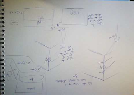
The design principles would have to be looking at contrast, balance, alignment, and space. These 4 have been my main design principles for most of my concepts due to my film going down that path. How balance can be used to tell a story, my film is mostly about balance and the effect it can have and through alignment and space, a much greater story can be told. Example This table shot above, how the actors are placed on either side of the frame balance perfectly, with colors and alignment. Mt title sequence would be doing the same through aligning the text and balencing the space.


3
CONCEPT
Following the reflection/shadow of one of the characters. And having the credits only appearing only in the shadow
This idea sounds good on paper but would require a lot of skill
and technology/time to make it work. I like the idea and the style
I could create with this, but this just wouldn't work with my skill
level and equipment, maybe for the future. The style would be
incredible and really help the mood and emotion towards my film, using the shadows of the characters would show diving into the characters dark side, or revealing what's hidden behind the wall of character. I really like this idea but not realistic.
Using negative space for the text to appear in, the shadow of the character and how I can balance that. How a moving object’s shadow would look like and if the text would be moving with the character or standing still. Revealing itself only when the shadow crosses over? These questions determine what principles I would be applying, balance proximity and space would be my main focus areas.


Having a simple clean background. With water/liquid falling down through the frame. Another idea was having the background the bottom half of the actors with sweat falling down. Revealing at the end of the credit sequence the parents are having a verbal fight.
CONCEPT
4

This idea is less abstract then my other ideas but could be more efficient in displaying a simple message/title sequence. Drops of water that would smudge the text into the transition, I would write the title sequence in ink and drop water droplets. This would set some amount of tone for my film but I don't think my film would connect or relate to this title sequence as well as the first concept.
The design principles I would be using, visual hierarchy, balance, and proximity. Reasoning behind choosing these to focus on is how close I will be with the camera to the title sequence, I will need to focus a lot on the space proximity, and how I can maximise the visual hierarchy with editing and placement.


5
CONCEPT
Strong contrast across with delicate simplicity. Finding locations where I can create contrast and use shape to create simplicity. Having the type carefully placed with the contrast.
This idea came later than the others because I had my 5 concepts already finalized, (the first concept was originally 2 ideas.) But this idea focuses on the simplicity combined with great contrast, I believe this could be very powerful in creating a strong message about the film, using shadow and line to depict a story. I would have to think about what object I would use to create this simple sleek and how they can appropriate to my film.
The design principles in this would be balance space and alignment, how I can use a minimal design to create balance with alignment and smart use of space.


